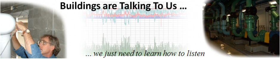
This string of posts started out as an e-mail response to a number of people involved with a Marriott training class where I teach the technical track. As the e-mail got longer and broader in scope, I realized that the information would be useful to a broader audience, including attendees in next year’s class. So I decided to develop a string of blog posts on the topic in place of the e-mail.
This first post will discuss using industry metrics and the Owner’s financial metrics and tolerance for risk along with utility analysis techniques and scoping skills to bracket the potential savings a project might deliver along with an order of magnitude for the project budget. I will then move on to discuss techniques I have used to develop budgets for implementing the various measures that are identified and developed during the investigation phase of a typical project.
Through-out, I will be using examples from the facility we are using as a living lab for our current Marriott classwork to demonstrate the concepts I am discussing.
Contents
These links will jump you to a specific topic of interest so you don’t have to read the entire post if something in the list below catches your eye. Each major section has a link that will bring you back here at the end of it.
- Catch-22
- Catch-22 and Retrocommissioning
- Utility Consumption Analysis; A Good First Step
- Firming Up the Utility Analysis Clues During a Scoping Walk-through
- Leveraging Annual Energy Consumption, Industry Metrics, and Engineering Judgment
- Leveraging Savings Projections and the Owner’s Financial Metrics to Develop a Project Budget
Catch-22
You may or may not be familiar with the book and movie titled Catch-22. The plot centers around a group of WWII airmen flying Mitchell B-25 bombers like the one in the wind tunnel in this picture.

Incidentally, this picture is taken from a really cool website called Shorpy.com that contains a huge number of vintage photos, many in very high resolution. Its well worth a visit to check it out. My biggest problem when I go there is moving on to something else.
In any case, Catch-22 was a bureaucratic snag that made it virtually impossible for someone to leave the military and was along the lines of the following.
Given how dangerous it was to be a member of a bomber crew during WWII, especially doing daylight bombing raids, the bomber crews would have had to be crazy to fly any more missions once the had been on one and made it back. And if they were crazy, then they could be grounded; all they had to do was ask.
But recognizing the dangers associated with flying daylight bombing missions was the act of a rational mind. Thus if you were flying missions you were crazy and could ask to be grounded. But as soon as you asked to be grounded, you demonstrated you were sane, and as a result, had to fly.
Catch-22 and Retrocommissioning
While retrocommissioning is (usually) not that dangerous, as practitioners, very early on in a project, we can find ourselves in a some-what Catch-22-like situation. Specifically, we have no problem with getting people interested in doing a project that will save energy and other resources. And they will be happy to fund just such a project as soon as we tell them how much they will save. Of course, to do that with any measure of accuracy, we have to do the project and thus, the dilemma.
Fortunately, the industry has matured to the point where there are some resources out there that can help us out of our dilemma, at least in my experience. What follows is a description of a technique I use to leverage these resources, which often opens the door to doing a project.
For this to work, you sometimes have to be willing to apply the process I will describe at risk. In other words, you have to be O.K. with spending some time up front in the belief that once you illustrate the potential that exists, the Owner will embrace the project and a contract will follow.
But more and more often, there are retrocommissioning programs available that can be used to offset the upfront costs and then support the effort moving forward. Puget Sound Energy’s Comprehensive Building Tune-up Program is an example of just such a program that I think is particularly well thought out because it supports the verification and persistence of benefits, not just the identification and implementation of improvements.
Utility Consumption Analysis; A Good First Step
In my experience, spending a little time looking at how a building uses energy can be a really good first step in any process. And taking the step sets up a number of other useful metrics, including a way to project a ball-park implementation budget for an RCx/EBCx (Retrocommissioning/Existing Building Commissioning) project. Illustrating that is the ultimate goal of this post.
I tend to use three different utility analysis techniques;
- Average daily consumption analysis,
- Interval data analysis, and
- Benchmarking.
Typically I will do an average daily analysis and a benchmark very early on for every project. If I have interval data from a smart meter or data loggers, I may also make a pass at a regression or two very during the early phases of my effort.
None of the techniques are particularly time consuming given computers and the tools I will mention. And they can provide valuable insight regarding the savings potential associated with a project, including where the opportunities might lie. If you supplement that information with some industry metrics and a bit of engineering judgment, you typically can gain insight into what you can afford to spend to capture those savings.
Average Daily Consumption Analysis
Average daily consumption analysis looks at utility patterns after normalizing the billing data so that it reflects the calendar month during which the consumption occurred. There is a subtle but important difference between normalizing the data and then plotting it as a function of the month and simply plotting the total consumption documented in the bill you received, say on say, May 8th.
- The bill you received on May 8th actually represents consumption that happened mostly in April. Plotting it as May’s consumption and then comparing things that were going on in May to that consumption will be misleading; the things happening in May didn’t have much to do with how the building used energy in April.
- Frequently, you want to compare the energy use pattern with what was going on in the building, like production levels or occupancy. Or, you may want to compare the data to what was going on outside the building, like cooling or heating degree days. Most data of that type is recorded by calendar month, so having your utility data normalized to the same time frame makes the comparison possible and legitimate.
I won’t go into the details of the technique here, which is something a number of my mentors taught me, including Bill Coad, Jerry Williams, Chuck McClure, Al Black and Phil Sutherlin. If you are curious about it, I wrote a paper a while back for ICEBO that you can take a look at. And Bill Koran built a tool for the California Commissioning Collaborative that makes it really easy. If you have a stack of utility bills with the date of the meter reading and the consumption for the billing period, all you have to do is enter those to pieces of data and the tool does the rest.
My point here is that the way a building uses energy can provide some insight into the potential savings that you might achieve if you were to go into it and initiate an RCx/EBCx process. I discuss the types of things you are looking for in the paper I mentioned above as well as in a number of previous posts, including Retrocommissioning Findings: Make Up Air Handling System Simultaneous Heating and Cooling – The Clues – #5 – The Utility Patterns Show High Baseline Consumption Patterns and Understanding an Anomaly – Part 2 – Average Daily Energy Consumption, so you can reference those items if you want to know more about how patters can be clues regarding different types of issues.
Average Daily Consumption Patterns for a Marriott Hotel in Atlanta, Georgia
Lets take a look at the data from the Marriott facility that the class teams and I are working with in Atlanta and discuss the clues we saw in the utility data patterns. I’ll start with the electrical side of things.
For that facility, if you contrast the average daily electrical consumption with a general indicator of the need to use energy for cooling, like cooling degree days, you see something that looks like this.

Note how there is clearly a correlation between the need for cooling (the cooling degree days) and energy use. But even if you don’t need cooling, the facility seems to have a pretty high baseline consumption (17,000 – 18,000 kWh per average day). In other words, they could turn the chiller plant off and still would use that much electricity every day.
Since this is a hotel, one of the things that might drive consumption is the occupancy rate. But if you compare the average daily pattern to that, there is not much of a correlation.

What we got from all of that was that while looking at central plant efficiency was probably important (because it affects the peak on the curve and the base load generated by the cooling plant), we also needed to be looking for equipment and systems that might be using more energy than necessary on an around the clock basis. Common examples are:
- Unscheduled equipment
- Non-optimized schedules
- Pumps moving more water than is needed or running against throttled discharge valves
- Fans moving more air than is needed or with poor discharge conditions or a high pressure drop at some point in the system
- Unnecessary simultaneous heating and cooling
Note that the last item, if it really exists, will likely contribute to the gas consumption baseline.
When we looked at the gas consumption pattern, we saw something similar to the electrical pattern; i.e. a peak in consumption that clearly was driven by the need to heat. But there was also a significant amount of around the clock gas consumption.

This facility is in Atlanta, so the climate is pretty mild and as a result, you would not expect to need to do actual heating (i.e. offset losses through the building envelope) during the summer.
When we looked to see if the gas consumption was driven by occupancy, there did not seem to be much of a relationship.

That is not always the case in the hospitality industry because gas consumption can be driven by how often the guests use the showers. In a mild climate, say San Diego, the gas consumption can be very much influenced by the use of domestic hot water.
So, our insights and conclusions from the gas consumption analysis were similar to those I mentioned for the electrical analysis. Specifically, the efficiency of the boiler conversion process would be important in that it would impact consumption across the boards. But given the mild climate, it sure seemed like there was a lot of gas being used in the summer.
If you have some familiarity with Heating, Ventilating and Air Conditioning (HVAC), then you may have already realized that the obvious thing to start looking for given the facility type and the high baseline gas consumption is simultaneous heating and cooling. You will recall that this is an item that showed up as a clue from the electrical analysis too. If you save thermal energy as a result of addressing a simultaneous heating and cooling issue, you will also save electrical energy.
Hospitality facilities are particularly prone to this type of issue because:
- They typically have a lot of meeting space with highly variable occupancy loads and significant ventilation requirements. Combine that with the need to dehumidify in a hot and humid environment and you may end up with a significant reheat load if you want to keep the building safe and comfortable.
- They tend to make chilled water and hot water available all year in the interest of guest satisfaction, which, of course, is what they are selling. The mantra in the industry is that they want to be able to please the little old lady who wants her room 80°F. On the other hand, the also want to please the ex-warrior bold who wants his room cold.
- They have corridor ventilation systems, which are 100% outdoor air systems that need to dehumidify a volume of air that is set by code requirements and occupancy while maintaining comfort in areas that are very lightly loaded. As a result, these systems can use a significant amount of preheat and reheat.
Interval Data Analysis
Another utility analysis option that is becoming more and more viable is the analysis of interval data from smart meters. If the utility is using smart meters and you jump through enough hoops with the utility representative (usually a financial representative of the Owner has to do the hoop jumping), you can gain access to the data stream from the smart utility meters. Sampling frequencies are typically once every 15 minutes to once every hour. Gaining access to this data can be a pretty powerful tool because instead of making gross correlations between average monthly patterns, you can correlate specific points in time with specific events.
One of the more powerful things you can do is look for correlation between a driver like outdoor air temperature and energy consumption. If there is reasonable correlation, you can then use the trend line feature in Excel to give you the equation of the line and then use that equation with an hourly weather data file to project annual consumption based on observed data over a smaller interval of time. This approach is often called a “regression analysis”.
For the technique to be effective, you need to have a reasonably good representation of the relationship between the dependent and the independent variable. In other words, a regression analysis of electrical consumption as a function of outdoor air temperature that is based on a day’s worth of data where the temperature held fairly steady will not really provide a valid prediction of what will happen over the course of a year (unless the climate is extremely stable) because the data set does not include data points for the broader range of outdoor conditions that will be seen over the course of a year.
Interval Data Patterns for a Marriott in Golden, Colorado
Sadly, the Marriott we are working with this year does not have whole building interval data available. But, the example below, taken from a previous training class in Golden, Colorado demonstrates the concept.
The heating load was based on the sensible energy equation, logged temperatures across a preheat coil, and a field measured flow rate (it was a constant volume system). The outdoor air temperature came from an hourly weather data file from a nearby airport that we obtained from NOAA.1

The plot is a called a scatter plot because, instead of connecting the dots with a line, you simply plot a dot for each data pair. In this case, a data pair consists of an outdoor air temperature (the independent variable) and the measured heating load across the preheat coil (the dependent variable).
One of the problems with this type of plot is that you can have a bunch of dots on top of each other; there are actually about 1,700 dots in the graph above. So, for instance, you don’t know if the little stream of data that heads towards the bottom of the graph in the 60°F range is something that happened a lot (meaning there are a bunch of dots on top of each other) or something that only happened a few times, or maybe only once (meaning there is only one dot at each location).
A trick for getting around that is to format the markers in the data set so that the fill is almost transparent. To do that, you right click on the data series and select “Format Data Series” and then “Format Markers”.

You should also turn off the Marker lines while you are at it. When you do that, the result looks like this; more dots = a darker cloud.

Looking at the plot this way, you can see that there is a fairly strong correlation between outdoor temperature and load. In a perfect world, for a preheat coil with a constant flow rate and a fixed leaving air temperature, it would be a straight line. But real systems see small flow variations (even if they are constant volume), have proportional bands in the in their control loops, and shut down occasionally. That’s what the points in a vertical line around 62°F were about; You can just barely see them meaning that particular event only happened a few times, maybe only once during the time data was being logged.
If you go grab a picture of the Golden Colorado climate from one of the climate data graphs available from the local forecast office (most offices seem to have these, but not in a very consistent location from site to site), you can see that the temperature span for which we have data (the yellow highlight) covers a significant part of the outdoor temperature span and hours at a given temperature that are seen over the course of a year for this particular location.

So, by invoking the Excel trend line feature for our data set (right click over the data series and select “Add Trendline”) …

… we can get a line and equation for the line predicted by the data set.

A couple of points here:
- The equation is the relationship between outdoor air temperature (X) and heating load (Y). That means you can use it with an hourly weather data file or a bin weather data file to predict the energy consumption for a year based on your data set.
- Given that this particular example was for a preheat coil that was trying to deliver neutral (70-72°F) make-up air to the corridors, if things were working right, the line would go through 0 Btu/hr between 70 and 72°F. It doesn’t and that is a clue that something is wrong with this system.
In this particular instance there were major problems with the control system. And once they were repaired, a similar analysis painted a picture of the results and allowed us to project the savings by subtracting the results predicted by one equation from the results predicted by the other.

In the context of whole building thermal data and using it to scope out a facility, if you did a regression like this and the Btu/hr line you generated crossed the temperature axis above the balance point of the building, that tells you that something is using heat when it may not need to be used, especially if you are working with a facility such as a commercial office building.
In most commercial facilities, the driver for thermal consumption when it is not needed for space heat will be reheat and domestic hot water. As a result, if you saw a pattern like I just described in your interval data analysis, you might focus some attention on those systems as your scoping process moved forward, especially if you saw high baseline gas consumption during the summer months and the building had a poor thermal benchmark.
Benchmarking
So far, we have been looking for patterns in how a building uses energy but not looking so much at the relative magnitude of the energy use. Benchmarks let you take a look at the magnitude of consumption relative to a similar type of facility in a similar climate zone with similar patterns of use. That can be important because, for example a facility located in a mild climate might have an electrical average daily consumption pattern that looks like the graph below (this is the “raw” chart you would get from the UCAT tool).

Anomaly aside ( the dip in August consumption), you can’t really tell if this is a facility that only has a modest requirement for mechanical cooling (the process driving the peak) and a normal base load vs. a facility with a huge base load and a normal requirement for mechanical cooling in hot weather.
In other words, the peak in September could be due to the fact that the facility normally can cool itself with outside air and only needs a little bit of extra electricity when it gets hot to keep things under control. Or, it could be using a lot of electricity all of the time and the need provide mechanical cooling causes it to use even more when it is hot outside.
Benchmarking lets you look at the magnitude of the consumption in the context of the facility type relative to its peers. One of the cool things about Bill Koran’s tool in this context is that it exposes the data behind the average daily consumption graphs. That means you can see the total annual consumption for a given facility (assuming you have data for a year or more) because the tool totals up the bills for you on an annual basis on the “Chart Data” tab.

If you take that number, convert it to Btus, and divide it by the building square footage, you end up with an EUI; a.k.a the Energy Utilization Intensity. If you have that, then you can benchmark the facility against it’s peers.
My point here is not to teach you how to do a benchmark. If you are curious about that, you will find a number of benchmarking resources in the resource list I maintain on the blog. Rather, I want to show you how that tool can help you understand the savings potential in a facility and as a result of that, the potential project cost.
Personally, I have developed a real affinity for the DOE Building Performance Database benchmarking tool (which is not in the current version of my resource list but will be added to the next revision).
Site vs. Source Energy
One of the things that comes up with most benchmarking tools is site vs. source energy. I did a blog post a while back that explores that topic a bit. So all I will say here is that taking a source energy perspective will (to my way of thinking) provide a more holistic perspective on what is really going on.
This slide, which I us a lot in class, is one way to think about that.

In very general terms:
- About 33-34% of the energy represented by the pile of coal ends up as electricity leaving the plant.
- About 6-8% of that is lost in the distribution system that delivers the electricity to your site.
- Between your meter and the VSD (Variable Speed Drive, if there is one) serving your end use load (say a pump or a fan) another 3-4% is lost.
- If there is a VSD, then even in the best of worlds, there is a 3-4% loss in the VSD.
- There will be another 4-10% (or more) loss in the motor.
- Finally, there will be another 10-12% loss in the pump or fan (if you are lucky; for a small pump or fan, the loss could be more like 40-50%).
If you take a “source energy” perspective, you will include the losses associated with items 1 and 2. If you take a site energy perspective, you only look at the losses from 3 on down on the list. To my way of thinking, if we really want to understand the impact of what we are doing with the resources of the planet, we need to take the source energy perspective.
We don’t inherit the world from our ancestors, we borrow it from our children Unknown
But no matter what your perspective is, what all of this really means is that anything we save at the end of the system is compounded by all of the factors on the list. If you are interested in how you go about converting source energy to site energy, I often reference an a publication titled Source Energy and Emission Factors for Energy Use in Buildings. If you are trying to understand how much of the power in a particular state is generated from fossil fuels, hydro, biomass, etc, then you might want to take a look at EGrid, which is a free Excel database of power plant statistics for all the licensed plants in the United States.
The Atlanta Marriott Benchmarks
Having said all of that, if I looked at the EUI for the Marriott facility I have been using for an example from a whole building perspective (gas and electricity combined) you get the following EUIs.

If you go to the DOE tool and look at these EUIs relative to all commercial buildings in Atlanta (the location of the facility) here is where you “land”. Lets look at site energy first. Remember, if you click on any of the images, the should open in a separate window where you can see them at a larger scale.2

If you study the histogram for a minute, clearly, relative to a fairly broad peer group (all commercial buildings in Atlanta that are in the database vs. hospitality buildings in Atlanta in the data base) there seems to be room for improvement at the facility we are looking at given our EUI of 134 kBtu/sq.ft./yr. relative to a median of 62 kBtu/sq.ft./yr. We are almost off the chart to the right, and moving right on the chart represents reduced efficiency.
Here is how things look from a whole building source energy perspective.

Not quite so far out, but still, some room for improvement relative to a fairly broad peer group given our EUI of 290 kBtu/sq.ft./yr. relative to the median of 186 kBtu/sq.ft./yr.
In some ways, you would expect a full service hotel to have a higher EUI than your average commercial building because of the round the clock use patterns. But when I narrowed the focus to Hotels in Atlanta GA that were of the same vintage and size, there was not enough data to make a meaningful comparison.
That said, large organizations often have internal metrics you can leverage to compare various facilities with-in the corporate umbrella. Marriot has just such a data base, and while I can’t really expose that here, I can tell you that when we benchmarked the Atlanta facility against other Marriott facilities in Atlanta and Georgia, the pattern suggested by the DOE tool was reinforced.
To get around the limitations in the DOE tool in terms of currently available data, I expanded my focus From Atlanta to include Hotels of a similar size and vintage in all of the States. This is the result I got when I looked at site energy.

So, even though the median shifted up, as we expected, the facility I was working with still benchmarked pretty high relative to the national median for Hotels; 134 kBtu/sq.ft./yr. vs. 94 Btu/sq.ft./yr.
Before I quit my benchmarking activity, I decided to look at the thermal and electrical EUIs separately. Here is the electrical data for our building followed by the site energy benchmark against all Hotels in the USA that were in the database.


And here is the thermal data and associated thermal site energy benchmark against all Hotels in the USA that were in the database.


The focus on benchmarks by energy source said to me that while there was probably opportunity to save both electrical energy and thermal energy, the thermal use at the facility I was working with represented largest contributor to our poor whole energy bench mark. Thus, I made plans to focus time on the heating systems and processes during my upcoming site visit.
Firming Up the Utility Analysis Clues During a Scoping Walk-through
Up to this point, my focus has been to illustrate how some simple, relatively quick analysis techniques can begin to focus your project.
In the case of the Marriott facility I have been using as an example, the relatively high baseline consumptions indicated the potential for savings. The poor benchmark scores tended to confirm the potential.
Based on past experience, likely targets associated with the clues garnered from the utility analysis included throttled pumps, simultaneous heating and cooling, scheduling opportunities, fan system pressure drop opportunities, and general optimization opportunities in the central plant.
When I arrived on site and started to scope things out, I, in fact, discovered a number of throttled pumps in the central plant (condenser water to the left and heating hot water to the right) …


… encountered systems where, when I touched the preheat water, chilled water, and reheat water coil piping, I found they were all active on a day when you should not have needed preheat and probably not much chilled water …

… noticed possible ways to reduce fan static by improving discharge conditions or optimizing filters selections (the picture is of an elbow with a potentially high static pressure loss on the discharge of a make up air system that runs round the clock) …

…. and general central plant optimization opportunities.

The picture above is the hot water distribution basin serving a two cell cross-flow cooling tower. In the picture, the cooling tower cell with the dry hot water basin (towards the top of the photo) had the fan running. In other words, the fan was moving air but no water was exposed to the air stream. So no heat was being rejected in that cell and the fan energy was being wasted as a result.
Evidence suggests it may do that about 2,000 hours a year. And the weirs (the little “V” shaped dams) in the basin with water in it are not really set up to optimize how the fill is used at part load conditions. Both of those items represent potentially low-cost opportunities to save resources by improving the performance of the cooling tower.
When I deployed loggers on a ball room AHU that showed symptoms similar to the make up air unit in the picture above, simultaneous heating and cooling was confirmed. And, the logger data also revealed the opportunity to optimize schedules.

In the chart above, for a given point in time, the air goes from the green line to the orange line to the yellow line to the blue line to the red line as it moves through this particular unit. For example, at slightly before 9 pm:
- Outdoor air at approximately 53°F (the green line) is mixed with return air to create an air stream that is about 67°F (the orange line)
- The preheat coil then heats that air up to about 80°F (the yellow line)
- The cooling coil then takes the air back down to about 53°F (the blue line)
- The reheat coil, at that particular time, probably is not doing anything (the red line)3
A somewhat less energy intensive approach to delivering 53°F supply air at this point in time would be to simply deliver 100% outdoor air. So there is definitely an opportunity to improve things here that will save thermal and electrical energy. Note also that the unit, which serves a ball room (which is not occupied 24/7), runs 24/7 based on the amperage.
The bottom line is that the clues gleaned from the utility analysis were starting to show up as real opportunities. At this point, I still didn’t know what they might be worth. That’s where the industry metrics and engineering judgment I mentioned at the beginning come into play, along with the annual consumption metrics that fell out of the utility analysis.
Leveraging Annual Energy Consumption, Industry Metrics, and Engineering Judgment
A Valuable Free Resource
The industry metrics I allude to are a meta-study prepared by Lawrence Berkeley National Labs. The original study, titled The Cost-Effectiveness of Commercial Buildings Commissioning was released in 2004. It was updated in 2009 and at that time, a separate analysis of a Monitoring Based Commissioning (MBCx) program targeted at the California University system was published.
The reports are full of very useful information regarding existing building commissioning and new construction commissioning including costs, energy savings potential, non-energy benefits, payback time, carbon reduction, etc. And they include extensive biographies that reference the various sources behind the report if you need more detail.
My point here is to cite the energy savings statistics from the report for existing building commissioning and then show how they can be used to project savings and budgets for an EBCx project. If you dig into the 2009 update to the original report, you will find the following information on page 30.

The report concludes, based on its data base, that existing building commissioning can save anywhere from 6% to 31% of a facilities energy consumption with the median being 16%.
Projecting Savings Potential
Based on the historical data in the report, there is some reason to think that an existing building commissioning project you are contemplating might also generate savings of a similar order of magnitude. If you select a percentage and apply it to the total utility costs that you collected by virtue of obtaining the utility bills to do a utility analysis and benchmark, you can project the savings you might anticipate based on the experience of others doing similar projects. The question then becomes:
What percentage should I use?
That’s where the clues you collect and develop as you do the utility analysis and walk the building the first time come into play, along with a little engineering judgment.
Applying Engineering Judgment and Past Experience
For instance, if you are looking at a project and:
- The average daily consumption patterns show shapes that follow drivers like cooling and heating degree days, and
- The building benchmark was at or below the median (meaning it is already more efficient than its peers), and
- As you walk through the building, the staff proudly points out how they just did a project to trim impellers on some their pumps that were oversized, and
- Trends and early data logger results show that schedules are generally working, heating and cooling processes are fairly well sequenced, and variable flow systems are in fact varying flow,
then, while there likely still are savings that can be achieved, the percentage you might anticipate would be towards the low end of the cost benefit report metrics.
In contrast if you are looking at the project and:
- The average daily consumption patterns show high baselines and flat profiles, and
- The building benchmarks extremely high relative to the median (meaning most of its peers are more efficient than it is), and
- As you walk through the building, you notice a lot of throttled pumps and the staff talks about how overwhelmed they are just putting out fires and appreciate the fact that you are there to start helping them cover the efficiency base because they know there are problems, and
- You walk by the motor control center and all of the selector switches are in “hand” (meaning even though there might be schedules in the control system, they are not being reflected by the actual system operating pattern because the switches would need to be in “Auto” for that to happen),
then there likely will be significant opportunities and the percentage savings you might anticipate would be at least the median value if not higher.
This is Not an Exact Science
Its important to realize that EBCx in general is not an exact science, especially in the context of what we are talking about here. There are two many variables in play and you don’t have a lot of control over some of them.
That means that when you are making your assessment of savings potential and project budgets, you want to be talking about a range, not an exact value. In other words, if you were looking at a facility that had signs of significant opportunity, you might suggest to the client that you anticipated savings in the range of 10% to 16% of their current utility budget rather than telling them that they will save 15.875328% of their current budget.
How much of a spread you use and what you center it on are all things you have to decide using your judgment and past experience, but in my experience it is better to understate things than overstate things.
And I also think its important that the client realize that at this point, what you are doing is a bit speculative. Granted, its speculation with a foundation in the building performance metrics and physical condition. But its not as good as what you will subsequently develop if the project moves forward and you begin to collect hard data from trends and functional tests.
For me, the bottom line is that expressing things as a range at this point reminds both myself and the client that the process we are engaged in is not an exact science. If we need to come to one number for a form or a report, we can talk the range over together and make a decision about an exact value to use based on what I know so far and the ramifications of under or overstating things moving forward from the client’s perspective.
As you move into the project, you will be able to firm up your savings estimates with hard field data from trends and functional testing. As a result, moving forward, you will be able to narrow your window down with confidence founded on the physical data you are collecting.
Projecting the Savings Range for the Marriott Project
Lets review what we know so far for the Marriott facility I have been using as an example.
- The utility consumption patterns show high baselines.
- The annual cost of gas and electricity is in the range of $872,738 per year.
- The facility benchmarks poorly against its peers, especially from a thermal energy standpoint.
-
When we walked the facility and started looking at some logger data, we saw evidence of quite a few opportunities to improve performance and save energy and other resources.
Based on this information, I concluded that we could comfortably anticipate saving 15-20% of their current utility cost. In other words, I thought we could pretty easily capture the median savings percentage seen by others and I suspected we could do better than that.
If you apply those percentages to the current utility cost, you come up with a savings potential of $126,547 to $174,548 for the project if we are successful.
Projecting Utility Program Incentives
If you have developed an understanding of how much energy you might save, you may also be able to leverage that information to project how many incentive dollars you might capture from a utility incentive program if one exists.
To do that, you need to convert your savings projections back into energy units like kW and therms. Frequently, unless there are clues that cause me to think otherwise, I will simply assume that I will save what-ever percentage range I have targeted off of each utility bill. In other words, if I anticipate savings 15% on the total utility bill, I will estimate that will be in the form of a 15% reduction in electrical costs along with a 15% reduction in thermal costs.
Doing that is another place where some engineering judgment comes into play. For example, if the building is an all electric building, then there will be no thermal savings and thus no thermal incentive.
Projecting Potential Incentives for the Marriott Project
The utility serving the Marriott facility we have been discussing does not offer any incentives currently for retrocommissioning. So, to illustrate how to estimate incentives, I will use the rates that exist for a project I am working on in California and apply them to the Marriott savings projections.
Specifically, we are involved in a number of projects where the utility offers a one time payment of $0.24 per kWh for electrical savings and $1.00 per therm for thermal savings. Here is what the analysis looks like for the Atlanta Marriott if those incentives applied there.

Clearly, incentives will “sweeten the pot” if they exist for the location where you are working. Being able to include an estimate of their value in your discussions with the Owner can help your proposed project be favorably received.
Leveraging Savings Projections and the Owner’s Financial Metrics to Develop a Project Budget
If you are applying this process to an facility, by the time you reach this point, you have an idea of what type of savings you can anticipate. And those numbers, while a bit speculative, have some foundation in the physics of the building.
Understanding the Owner’s Financial Perspective
To understand how much it would be possible to spend to capture those savings, you need to have a discussion with the Owner about their tolerance for risk and what type of return they would be looking for on their investment. This can vary significantly from Owner to Owner.
For example, in the hospitality industry, Owners tend to be people playing games with investments in real estate. A hotel makes money by booking guest and meeting rooms and keeping occupancy levels high. They also make a lot of money from the food and beverage services. So frequently, infrastructure improvement projects have to compete with things that are going to attract or retain guests, like room or lobby renovations or a new wine bar.
If those investments can provide positive cash flow in 2-3 years or less (and they can) then, for a person who is viewing the entire operation as a money game, to be attracted to an investment that will save energy, we have to structure the project so it will deliver a similar return. From their perspective, they may not even be financially involved with the facility 4 or 5 years from now and they want to be able to realize the full return on any investment they make before they move on.
In contrast, Owners like Universities and the Military are in it for the long haul. For Universities in particular, many, if not all of their buildings will be around for decades or even centuries and the revenue comes from being able to attract and retain educators to teach their students and perform research. As a result, many universities have a long-term perspective on infrastructure improvements and will entertain five to ten year simple paybacks.
On some military bases we have worked on, if the capital is available, they will consider an investment that will pay for itself with-in the anticipated system life cycle. For example,
- If the anticipated system life is 25 years. and
- The system is 5 years into that cycle, and
- you are proposing a persistent improvement like changing a duct fitting to save fan energy which can be expensive but is likely to remain in place once you make the change
then they may consider doing it, even if the anticipated payback window is 12 years. From there perspective, they will be running the system another 20 years so after 12 years, they are making money.
Incidentally, a really good resource for understanding finances as they relate to efficiency is Mark Jewell’s website. Mark posts something just about every day on his blog pertaining to the financial and sales aspect of selling energy efficiency projects.
Projecting a Project Budget
If you understand the Owners financial metrics and express them as a simple payback, then it becomes fairly straight-forward to develop a project budget range. For example, using some round numbers to make the math easy, lets say a facility is spending $100,000 a year for energy. After doing a utility analysis, a benchmark, and walking through the facility with the operators, you conclude that they likely can save 10-16% of their energy cost via EBCx. So that means you anticipate a savings in the range of $10,000 to $16,000 per year.
If the Owner is open to paybacks in the 5 to 10 year range, depending on the nature of the project, that means your potential project budget could be in the range of $50,000 (5 years x $10,000 per year) to $160,000 (10 years x $16,000). Granted, those are pretty broad metrics. But they have a basis in the physics of the building and may allow you to take some things off the table (or put them on the table).
Frequently, I find that facility operators and engineers may already have some ideas regarding where they want to head to conserve energy and one of the reasons they are interested in having you do the EBCx project is that they think it might help them sell their idea to the Management and the Owner. For example, consider a facility served by a central chilled water and hot water plant with two major air handling systems. The systems are 15 years old and the operators hope your project will identify savings that will support a chiller upgrade and conversion from pneumatic to DDC controls on their two major air handling systems.
In anticipation of the need to do that, they have already talked to vendors about the potential cost of these measures. Their favored mechanical contractor has given them a budget range of $250,000 to $300,000 for the chiller project. Their favored control vendor has given them a budget range of $75,000 – $100,000 for the control system work.
If, based on your analysis at this point, you are anticipating being able to support an efficiency project with a budget of $50,000 – $160,000 that captures the savings you identify, then your project probably will not deliver the new chiller for them as an Energy Conservation Measure (ECM). That doesn’t’ mean they won’t do the project eventually. At some point, their existing chiller will wear out and they will need to do a Capital Improvement project to replace it.
And your project will likely provide important data to help facilitate the purchase and installation of of the new chiller, like provide insight into the actual load profile, allowing them to purchase the chiller on a life cycle cost basis. Or, you may discover a lot of simultaneous heating and cooling or economizer issues that, when corrected, reduce the peak tonnage required. And when they do decide to replace their chiller, they likely will save some energy since the new machinery and system will be more efficient if selected properly.
In contrast, the AHU control upgrade project may be a very viable project for funding via your EBCx effort. I say that because the AHUs are the end of the line users of energy in the facility and frequently, the resolution of commissioning findings in air handling systems revolves around making improvements to the control systems serving them.
Projecting the Marriott Project Budget
The Marriott facility I have been using as an example in this post is a bit different from a lot of the ones I have worked with because they have a single Owner who’s financial interest is investing money to support a retirement fund. So, while they have an interest in the revenue that can be generated by investing in a new wine bar or Starbucks, just like any other Hotel Owner, they also have more of a long term perspective on projects, especially infrastructure projects.
As a result, they are willing to consider projects with a simple payback in the range of 2 to 5 years. This table summarizes what that means given the other information we have developed for the facility.

The bottom line is fairly early on, we were able to tell the Director of Engineering what we thought we could save and thus, what we thought we might be able to afford in terms of improvements. As a result, the effort of the various project teams working on the facility has been focused to were they will provide the most benefit for both the near term and the long term. And the Engineering Department is already starting to do some planning based on what we were able to project.
Conclusion
So there you have it, my technique for developing preliminary savings and budget estimates from a facility’s utility data, industry metrics, and some engineering judgment. The next post will take a look at techniques you can use to identify the costs associated with specific measures as you move forward with a project and begin to identify firm targets for improvement.

David Sellers
Senior Engineer – Facility Dynamics Engineering
Click here for a recent index to previous posts
1. See my blog post titled Good News about NWS Weather Data, Plus Working with Date and Time in Excel to find out more about how to get this type of data.
2. I should mention that the site recently went through an upgrade and the images I used here are from an analysis that was done before the “new look”. Meaning if you go to the site now, it will look a bit different and have additional features.
3. The reason the red line and blue line are not directly on top of each other when they are seeing the same temperature condition is due to the relative accuracy of the sensors, which I did not correct for when I made this particular graph.